
by Dr. Watson Scott Swail, President & Senior Research Scientist
Since I wrote my piece on the Biden Administration’s Student Loan Debt Reduction Plan last week, there has been a lot of information and fallout by colleagues and friends on the issue. Most people I know are on the positive side of the policy, saying that this is helpful for a lot of people who are burdened by student debt. The other side includes GOP and centrist Democrats who see this as an unfair policy wagged by the progressive tail of the Democratic Party.
Last week I made it clear that I find the remission policy problematic in a number of ways, mostly due to the following issues:
- The size of the contribution isn’t enough to make a sizable difference in the debt that most people carry; if they really wanted to make a difference, it should have been higher; perhaps double or triple;
- It isn’t a policy built on fairness to other borrowers who have sacrificed to pay their student loans;
- It doesn’t offer support for parents who took out PLUS loans (they say it does privately, but there is currently no public information that suggests this will happen).
- It isn’t targeted towards the truly needs (by income) and travels far too high up the income ladder;
- It does nothing to fix the problem that started this issue to begin with. Not. A. Thing.
Regardless of the view of myself and others, I’d like to focus this Swail Letter on the reasons this is a real and significant issues for so many Americans. Beyond politics, let us not lose sight of how damaging college costs and student debt are on people, while we also acknowledge that people with student loan debt are a small group of citizens compared to the the number of people in the workforce who did not attend college. Regardless, we do know that there exists $1.6 trillion in student loan debt for over 45 million borrowers (Q2 of 2022), with an average loan debt of $35,790.[1] As I will note below, that high average is skewed by fewer high-end borrowers, but is still significant regardless.
The chart below breaks these numbers down by amount owed, with the orange bars depicting borrowers and blue bars depicting loan debt within each category of debt. The summary conclusion of this chart is that most of the borrowers are in the lower levels of debt, while most of the total loan debt is carried by a smaller group of borrowers who borrowed large amounts to finance their education. For example, 16 percent of all borrowers have less than $5k in debt, equivalent to 1 percent of all student debt. Similarly, 17 percent of all borrowers have between $5k and $10k of debt, equivalent to 3 percent of all debt. At the other end of the spectrum, only 2 percent of all borrowers account for 17 percent of total debt and 10 percent of all borrowers account for almost half of total student debt (46 percent). Comparatively, 54 of all borrowers accounting for only 12 percent of the debt. Thus, borrowers are skewed towards lower levels of debt, while debt is skewed toward a small, perhaps more unique, set of borrowers.
Exhibit 1. Student Loan Debt and Number of Borrowers by Debt Category, 2022 (2nd Quarter)
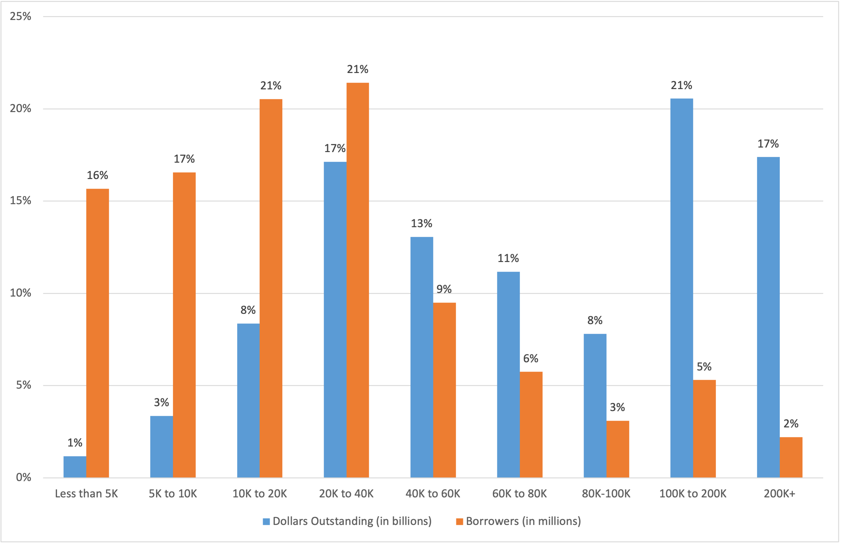
SOURCE: Federal Student Aid Data, US Department of Education (downloaded by author on 8/31/22).
Without having the details available, I would imagine that the small percentage of borrowers with large levels of debt are those in graduate and professional schools. While the press makes much of anecdotal reports of unique borrowers who have seemingly insurmountable debt (and those people do exist), these are outliers that make for good print rather than norms. When we use averages and medians, those at the extremes are always “covered” to a degree by the analysis. For most of the high-level borrowers, they will likely (the hope is…) be entering high-income jobs or jobs that will become high income over time. That is, they will be able to pay off their high debt (e.g., doctors, lawyers, hedge-fund managers!). Those who have low levels of debt should be able to wipe off that debt with some diligence, too, such as those with $10,000 of debt. For me, the real issue are borrowers in the middle: those with somewhere between $20,000 and $80,000 of debt. We know from these data that the average debt is about $36,000 per borrower, but this number is heavily skewed by the large debt on the right side of the distribution. According to data from the US Department of Education’s Baccalaureate & Beyond (B&B) Study, the average debt for a student borrower one year after his/her graduation from a bachelor’s program is approximately $27,000 (calculated by author using DataLab[2]).
To provide an additional viewpoint, Exhibit 2 illustrates loan debt for four-year graduates (2016-17) 12 months after graduation (B&B). (I expect that these numbers would be slightly higher today).[3] It illustrates the number used above, $26,887, which denotes the average amount of loan debt for borrowers (does not contain zeros, or non-borrowers). The data here are somewhat remarkable, illustrating that students who attend open-admission or minimally selective institutions have much higher debt, on median, than those attending very selective or moderately selective schools. As well, the amount of debt for borrowers who attended a public four-year school is remarkably similar to that of those who attended private four-year schools. One can also see the median debt for those who attended for profit schools ($45,941).
Exhibit 2. Median Student Loan Debt by Institutional Selectivity and Institution Type/Sector, 2016-17
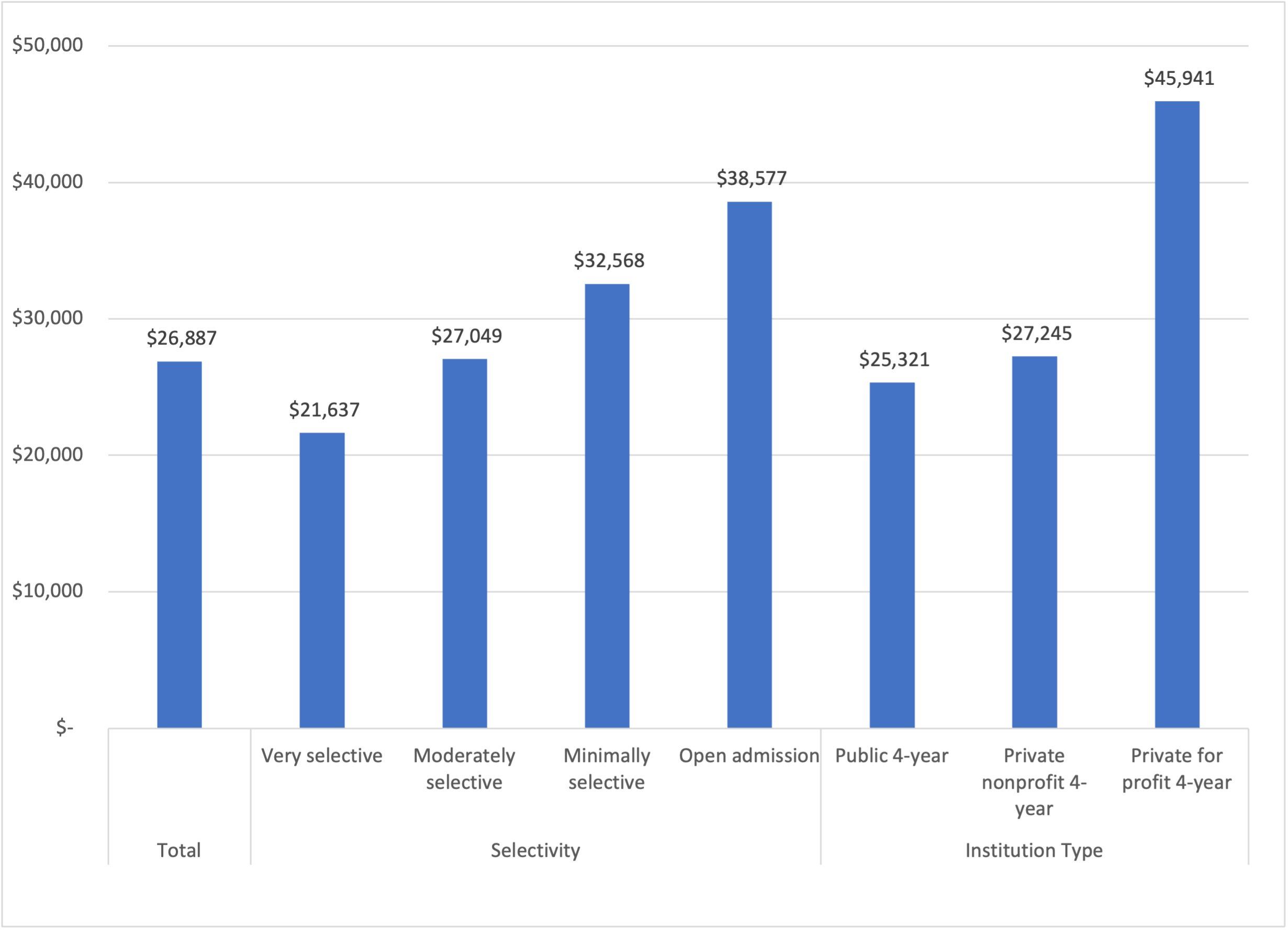
SOURCE: Data from Baccalaureate & Beyond Study (B&B), DataLab via US Department of Education (tables created and downloaded by author 8/31/22).
Exhibit 3. Median Student Loan Debt by Institutional Selectivity and Institution Type/Sector, 2016-17
SOURCE: Data from Baccalaureate & Beyond Study (B&B), DataLab via US Department of Education (tables created and downloaded by author 8/31/22).
This likely illustrates two possibilities about the data. First, it showcases the potential impact of institutional aid from private, not-for-profit institutions on the amount of debt required to attend private institutions. And second, there may be an affluency impact defined by dependent borrowers who were able to bring savings and other non-loan funds to bear on their education (e.g., savings, 529 plans, available revenues). Still, this perspective shows us that the cost difference of attending a public institution does not always result in a lower cost due to (a) Title IV funds that stream to private institutions and (b) the endowment levels and other levers used at these institutions to reduce net price.
Exhibit 4 below also used the B&B data, this time focusing on dependent students and their cumulative loan debt by the parents’ income level. For this chart, I used under $50k, between $50 and $100k, and $100 to 125K (NOTE: the data get sketchy at this last category; the medians are definitely lower but standard errors are higher, so beware).
Exhibit 4. Cumulative Federal Student Loan Debt by Parents’ Income, 2016-17
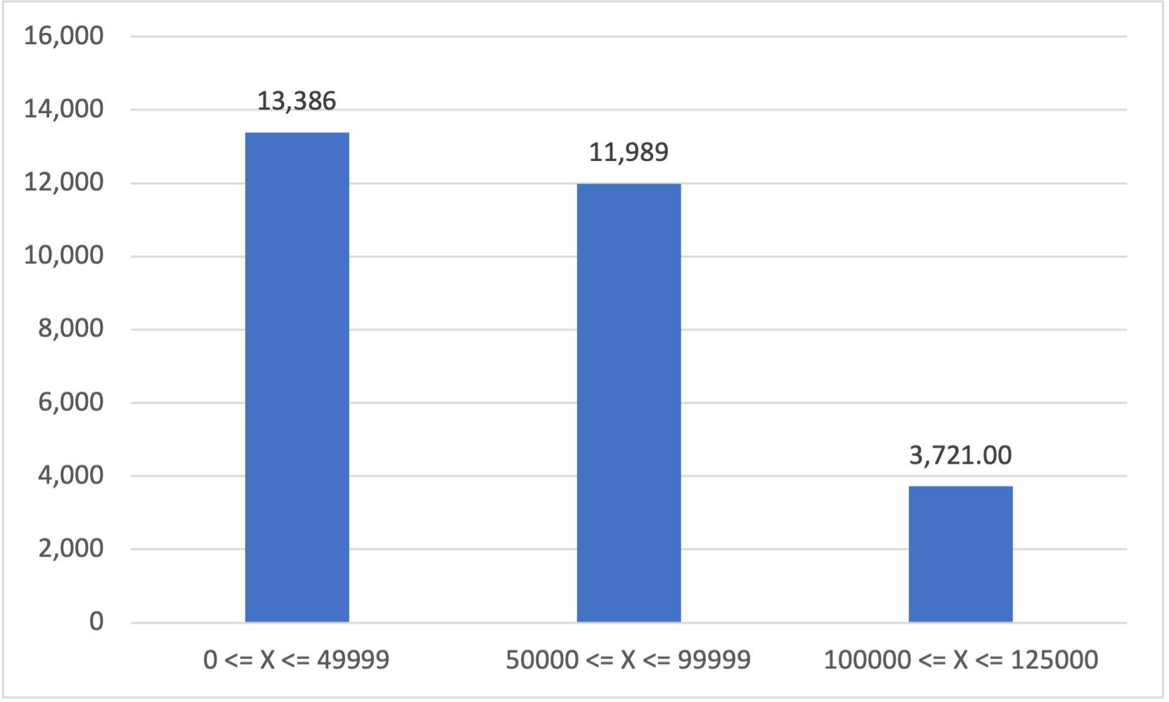
SOURCE: Data from Baccalaureate & Beyond Study (B&B), DataLab via US Department of Education (tables created and downloaded by author 8/31/22).
What is interesting about this illustration is that lower income families have a higher cumulative debt than the slightly higher income families, and much higher than those at the highest levels.
Finally, Exhibit 5 below depicts a look at tuition and fee costs in 1980 versus 2020, and the change in cost after adjusting for inflation (the data charts are provided below as well). The purpose of this graphic is to showcase the change in time of college versus non-college costs. This exhibit clearly illustrates the issues that are crushing so many people with regard to going to college and student loan debt. I added data for two universities for comparison. One is the University of Manitoba, where I attended for undergrad, because I clearly remember writing a check for $900 in 1980 for my first two semesters. I paid that easily with my summer job as a painter. I also provided data on the University of Pennsylvania for comparison (only because I found those data fairly quickly). Other comparators include US averages for two-year public institutions, four-year publics, and four-year privates (not-for-profit). And then, to give a real feel, I added average salary, average car and house prices, as well as state support for higher education and the Pell Grant maximum in 1980 and 2020. A mixed bag, for sure, but something for comparative purposes.
Exhibit 5. Average Costs of Tuition and Fees Compared to Other Relative Costs, 1980 and 2020

Here is what we learned.
First, I was lucky to attend UManitoba, mostly because it was excellent, affordable, and, over time, the cost rose 91 percent over 40 years (all numbers adjusted for CPI). This is a relatively low increase in TF costs and showcases the support provided by provincial governments in supporting higher education in Canada. Comparatively, the change in pricing for public four-year institutions in the US increased from $800 in 1080 to $10,570 in 2020, an adjusted increase of 321 percent. Interestingly, the tuition and fee charges at UPenn increase 113 percent, and four-year privates increased 228 percent, far lower than the publics. During this time, state support increased 84 percent in real dollars, but the Pell Grant maximum increased only 15 percent. Takeaway? For low-income students, the Pell isn’t meeting its need over time given the large increases in the cost of public and private higher education.
When compared to other factors in society, the average salary increased 21 percent, average new car 18 percent, and the average house 63 percent. Thus, everything has increased, but the tuition and fee charge increases are striking to a word. We must remind readers that this is only published tuition and fee charges, and on one hand does not include books, supplies, or room and board charges. It also does not includes tuition discounting and other vehicles that result in a lower net cost to students.
All this information, in summary, tells us that we have a real issue at hand which will only get worse as time marches on. This is my biggest problem with the Biden policy: it does nothing to assuage this issue, to help tomorrow’s students, or to help students who have been diligent enough to pay off their debt before the policy goes into action.
I hope this is useful. More to come.
[1] https://studentaid.gov/data-center/student/portfolio.
[2] https://nces.ed.gov/datalab/.
[3] The B&B study, which works on a regular basis off the NPSAS study, was last conducted during the 2016-17 academic year. A 2020 study has been conducted with first data available in fall 2022. Thus, these numbers will be updated soon.
